S y m b o l i c C o l o r s
When given the assignment to look for images displaying color schemes that rely on cultural cues, I was rather lost. I wasn't sure where to look first. But as I wandered through the library and browsed through the design books, I came across this book titled "New Girly Graphics." That got me thinking: what makes a design girly or feminine? What cultural cues do we use to associate with girlishness?
Disclaimer: To make things simple, I'm going by society's traditional sense of femininity rather than the more modern standards.
Over the past 100 years, our Western culture has associated girls with the color pink. It's debatable as to how that came along, but if one were to pull any Westerner off the street and ask them what color they associate with girls, more often than not they would answer with pink.
In this first image, it's pretty clear how feminine this looks because of all the pink. Flowers, and birds, and, the bedecked woman aside. The bright and cheery color scheme is mostly on the cool side, which makes all the warmer colors appear more like pink or purple.
This next image has much less pink. Yet it still looks rather feminine. Why? In this instance, I think because of the low saturation with the pops of brighter, mostly-cooler colors still gives the appearance of nature. There's almost a floral sense to the color scheme still, which Western society has deemed feminine.
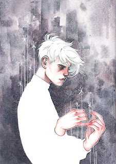
In this final image, there are no flowers, no cute woodland creatures to give us the cue that this is a "girly" graphic. So how do we read this as feminine? The colors are light, airy, delicate. Even the bright yellow of the girl's blouse still has that lightness about it. In a way it can reflect the traditionally delicate sensibility that has so often been associated with women.
To summarize, we can take social cues to figure out the meanings of color, but ultimately a color is just a color. Color has no gender or culture, it only carries those associations BECAUSE of that culture.
Disclaimer: To make things simple, I'm going by society's traditional sense of femininity rather than the more modern standards.
 |
| Seiichi Ohashi, New Girly Graphics, pg. 176 |
In this first image, it's pretty clear how feminine this looks because of all the pink. Flowers, and birds, and, the bedecked woman aside. The bright and cheery color scheme is mostly on the cool side, which makes all the warmer colors appear more like pink or purple.
 |
| Akie Sakuri, New Girly Graphics, pg. 174 |
This next image has much less pink. Yet it still looks rather feminine. Why? In this instance, I think because of the low saturation with the pops of brighter, mostly-cooler colors still gives the appearance of nature. There's almost a floral sense to the color scheme still, which Western society has deemed feminine.
 |
| Takuma Takasaki, New Girly Graphics, pg 78 |
To summarize, we can take social cues to figure out the meanings of color, but ultimately a color is just a color. Color has no gender or culture, it only carries those associations BECAUSE of that culture.


Comments
Post a Comment