B a l a n c e
Balance is something artists should keep in mind when they are creating a composition so that it can look pleasing. Leaving a composition imbalanced can make it feel unfinished or lopsided and it can make the viewer feel uncomfortable or dissatisfied.
Here are some pictures I found this week that look really interesting!
This image by Craig Phillips shows asymmetrical balance. The building that the man is standing on stretches across the bottom of the picture plane while a taller, heavily textured building stretches up towards the upper right corner. Even though there are a lot of diagonal lines in the composition, there is a sense of balance because of the general horizontal and vertical lines made by the buildings.
In this illustrated page from her book, Marian Bantjes uses symmetrical balance. The lines formed by the patterns behind the script span across the spread, forming an "x" in the centerfold.
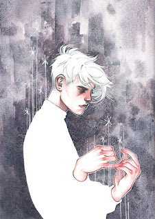
There is more symmetrical balance formed in this painting by Sacha Treager by where the face is placed in the picture plane. The nose, lips, and chin that sit right in the center also form imaginary parallel lines. It's all very centralized and very still; very stable.
This image by Beppe Giacobbe is balanced because of the horizontal and vertical nature of the subjects.The horizon stretches across the middle of the picture and creates a very serene background. The bag sits firmly on the sand, in the middle of the picture plane. The vertical stripes on the bag also add a sense of stability because of how generally straight they are.
Here are some pictures I found this week that look really interesting!
 |
| Craig Phillips, Workbook 37, pg 362 |
This image by Craig Phillips shows asymmetrical balance. The building that the man is standing on stretches across the bottom of the picture plane while a taller, heavily textured building stretches up towards the upper right corner. Even though there are a lot of diagonal lines in the composition, there is a sense of balance because of the general horizontal and vertical lines made by the buildings.
 |
| Marian Bantjes, I Wonder, pg 56-57 |
 |
| Sacha Treager, Workbook 37, pg 314 |
There is more symmetrical balance formed in this painting by Sacha Treager by where the face is placed in the picture plane. The nose, lips, and chin that sit right in the center also form imaginary parallel lines. It's all very centralized and very still; very stable.
 |
| Beppe Giacobbe, iSpot.com |
This image by Beppe Giacobbe is balanced because of the horizontal and vertical nature of the subjects.The horizon stretches across the middle of the picture and creates a very serene background. The bag sits firmly on the sand, in the middle of the picture plane. The vertical stripes on the bag also add a sense of stability because of how generally straight they are.

Comments
Post a Comment