C o l o r D i s c o r d
When
it comes to the rules of art, often we are encouraged and expected to
break them! Here are some examples of work that I believe breaks color
harmony rules yet still creates interesting images.
When you first look at this image, it seems pretty harmonious, right? But if you look closer you can see a purple outline around all the cows. It's more noticeable in print, but that outline is actually of the same value and saturation as the green grass. It causes some color vibration. However in this composition, it works because it brings attention to the cows and make them stand out even more from the image.
In this printing by Raymond Verdaguer, the color scheme is mostly analogous. However the colors themselves are still quite a bit off. On the paper, the orange and that mauve are very similar in value, which adds some color clashing. Now orange and purple are considered parts of the split complementary color scheme but even that splash of a cooler purple throws the color scheme off... And it works! My guess is that it's because the colors are broken up by the black and white lines that make up the face.
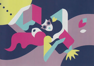
In this image that lime green stripe stands out. It's the only lime green thing on the picture plane. It seems rather disharmonious because the surrounding colors are more muted. The red of the woman's shirt would have been enough for a pleasing composition, but that splash of lime green just makes the woman stand out even more.
 |
| John Lambert, Workbook 23, pg 213 |
 |
| Raymond Verdaguer, Workbook 23, pg29 |
In this printing by Raymond Verdaguer, the color scheme is mostly analogous. However the colors themselves are still quite a bit off. On the paper, the orange and that mauve are very similar in value, which adds some color clashing. Now orange and purple are considered parts of the split complementary color scheme but even that splash of a cooler purple throws the color scheme off... And it works! My guess is that it's because the colors are broken up by the black and white lines that make up the face.
 |
| Allen Brewer, Workbook 23, pg 453 |
In this image that lime green stripe stands out. It's the only lime green thing on the picture plane. It seems rather disharmonious because the surrounding colors are more muted. The red of the woman's shirt would have been enough for a pleasing composition, but that splash of lime green just makes the woman stand out even more.
Comments
Post a Comment