C o l o r H a r m o n y
Color harmony is an important factor to take into account when deciding a color scheme. Well, harmony or intentional disharmony. Think about what you want to get across then go from there.
Here are this weeks images!
This is an example of an analogous color scheme. All these pastel colors are cool; blue, green, and hints of purple. Even the warm colors in the image, the oranges, the yellows, and browns, all have a cooler temperature
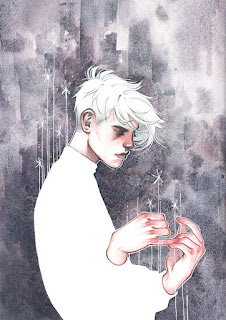
This image is a perfect example of a monochromatic color scheme. This image was made with only a black medium, so only black, white, and shades of grey
This image could be analogous because of the majority of blue tints and shades, but I would argue that this was complementary! The warmth of colors in the woman's skin and hair contrasts the coolness of the background!
Here are this weeks images!
 |
| David Johnson, Workbook 25, pg 584 |
 |
| Gris Grimly, Workbook 25, pg 390 |
This image is a perfect example of a monochromatic color scheme. This image was made with only a black medium, so only black, white, and shades of grey
 |
| Jesse Reisch, Workbook 25, pg 584 |

Comments
Post a Comment