C o l o r I n s p i r a t i o n
Color is a huge part of life. The bright red stop sign warns us to stop at intersections, or invigorate us. Clean white rooms make us feel at peace, or uncomfortable in the sterility.
As artists, we must take color into account when creating our compositions because it's usually the first thing out viewers will notice.
Here are some color schemes I found enjoyable!

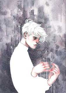
Besides the graphic novel-like style, the main thing that drew my eye was the odd color scheme: red-orange and olive green! It's complementary, but yet because the colors are so warm it looks a bit more original!
 I was originally drawn to the bright blues and pinks. When I put it into a mosaic filter, however, that pink completely disappeared! Oh well, I still liked the use of vibrant blues! It's all very analagous

I was drawn to this image because it looked like there were bright blues and teals peeking through the umbers and siennas. It all vanished in the mosaic and made just different variations of brown! This could almost be mono-chromatic, but there are slight variations in the hue.
As artists, we must take color into account when creating our compositions because it's usually the first thing out viewers will notice.
Here are some color schemes I found enjoyable!
 |
| Tomer Hanuka, Workbook 29, pg 110 |

Besides the graphic novel-like style, the main thing that drew my eye was the odd color scheme: red-orange and olive green! It's complementary, but yet because the colors are so warm it looks a bit more original!
 |
| Patti Molica, Workbook 29, pg 236 |
 I was originally drawn to the bright blues and pinks. When I put it into a mosaic filter, however, that pink completely disappeared! Oh well, I still liked the use of vibrant blues! It's all very analagous
 |
| Robert Barrett, Workbook 29, pg 355 |

Comments
Post a Comment