C r e a t i v i t y
The dictionary defines creativity as "the ability to transcend traditional ideas, rules, patterns, relationships, or the like, and to create meaningful new ideas, forms, methods, interpretations." Rather accurate, don't you think? We must remember, however, that creativity is very subjective in its own right. People are different; their experiences, tastes, and perspectives all can affect what they think is "creative."
Now I'm a book hoarder, (when the first 4 years of your professional life is working at a bookstore, it makes you a book lover) but being an artist first, I think I have license when I say that I judge books by their cover! And I often do, actually. Here are some books with covers that I thought were particularly creative and attractive!
This design was creative in 3 ways: the composition, the text, and the content. I was attracted to the contrasting colors and values. The red shoe stands out in the spotlight. It's a very striking image. The swirling decorative font is very elegant and reminds me of old fairy tales. The type is also embossed in silver so it shines in the light. Finally the content is fascinating. If you couldn't guess, this book is a futuristic retelling of Cinderella. The shoe and the font help with that, while the mechanical skeleton foot overlaid on top really matches a facet of the book.
I thought this cover was creative because of the use of symmetrical balance to portray the balance of good and evil in this story. The two main characters are sent to schools to learn to be a villain and hero, respectively. The contrast of the girls' appearances next to the different castles and the symbolism of the bridge beneath the title coincides perfectly with the content of the book!
This book cover was creative because of symmetrical balance, again, but horizontally rather than vertical. The contrast of cool colors and modern sky scrapers versus the warm colors and whimsical towers was compelling to look at! This book is about characters jumping into different dimensions, so conceptually the cover coincides well! The little detail of the word "you" being overlapped by the tower plays with the use of depth in the picture plane which was a delight to discover.
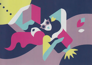
Okay, so I bought this book purely because of the cover! I haven't even read it yet! I realize that I'm attracted to symmetrical balance! The color scheme was also beautiful and very analogous, yet bold. The emphasis of the figure in the center was interesting. I figured that a lot of the imagery in the composition are tied to the story in some way, so I'll assume that the cover is fitting conceptually
Now I'm a book hoarder, (when the first 4 years of your professional life is working at a bookstore, it makes you a book lover) but being an artist first, I think I have license when I say that I judge books by their cover! And I often do, actually. Here are some books with covers that I thought were particularly creative and attractive!
 |
| Illustration by Michael O, Cover design by Rich Deas |
This design was creative in 3 ways: the composition, the text, and the content. I was attracted to the contrasting colors and values. The red shoe stands out in the spotlight. It's a very striking image. The swirling decorative font is very elegant and reminds me of old fairy tales. The type is also embossed in silver so it shines in the light. Finally the content is fascinating. If you couldn't guess, this book is a futuristic retelling of Cinderella. The shoe and the font help with that, while the mechanical skeleton foot overlaid on top really matches a facet of the book.
 |
| Cover by Iacopo Bruno, |
I thought this cover was creative because of the use of symmetrical balance to portray the balance of good and evil in this story. The two main characters are sent to schools to learn to be a villain and hero, respectively. The contrast of the girls' appearances next to the different castles and the symbolism of the bridge beneath the title coincides perfectly with the content of the book!
 |
| Art by Craig Shields, Design by Elizabeth Clark |
This book cover was creative because of symmetrical balance, again, but horizontally rather than vertical. The contrast of cool colors and modern sky scrapers versus the warm colors and whimsical towers was compelling to look at! This book is about characters jumping into different dimensions, so conceptually the cover coincides well! The little detail of the word "you" being overlapped by the tower plays with the use of depth in the picture plane which was a delight to discover.
 |
| Illustration by Ken Taylor, Design by Lizzy Bromley |

Comments
Post a Comment