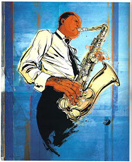
Playing with positive and negative space is the easiest way to create an interesting image. As long as both the foreground and background have something cool going on, you'll have a successful composition! If you squint your eyes at your artwork, usually you can see a silhouette of your subject matter. The space around it is the negative space. Is it as interesting in shape as the subject? That's what you have to think about.
Here are some examples for this week!
 |
| Robert Rodriguez, Workbook 33, pg. 161 |
In this image on the left, the positive and negative space are really cleverly used. The counter in the front (along the bottom) is just solid black, yet our eyes read it as a counter top. The man in the mid-ground is rendered more sharply and even is outlined. In the background the complementary reds and greens add vibrancy and the woman is rendered softly, without the lines. This makes for a compelling image all around
 |
| Echo Chernik, Workbook 33, pg. 263 |
 |
| Echo Chernik, Workbook 33, pg. 262 |
 |
| John Shroades, Workbook 33, pg. 141 |
These two images by Echo Chernik are interesting because they are so close-up. Even so, there are interesting pattnerns and shapes that bring emphasis to the figures.
This image by John Shroades has a wonderful sense of depth. In the foreground, towards the bottom, we see the rocks that the figures are standing on. It fees as if we are standing on them too. The large dragon in the mid-ground stretches upward towards the reddened sky. The castle, the trees, and the swirl in the background provide interesting places for our eyes to explore.


Comments
Post a Comment